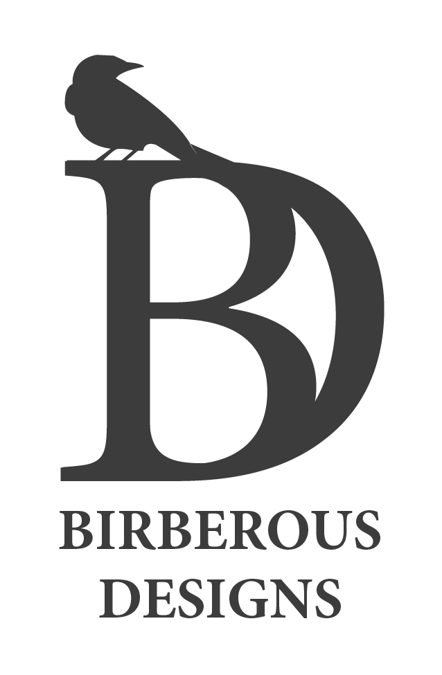
Graphic Design
GFS CHEMICALS QUANTUM
PRODUCT LAUNCH
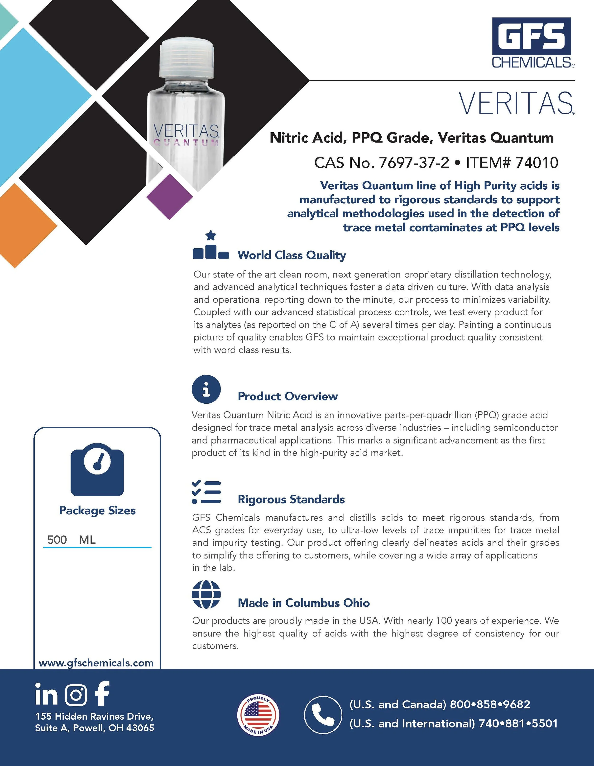
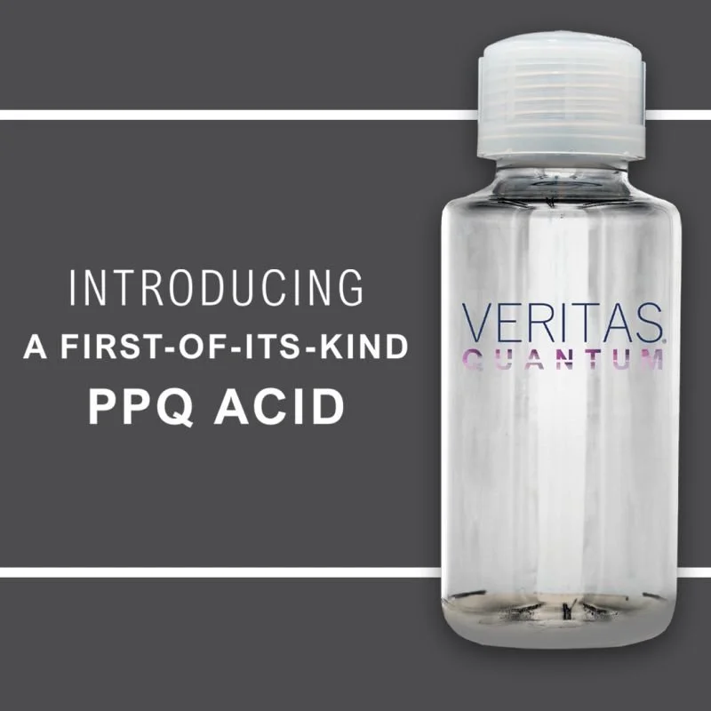
🌐Overview: When GFS Chemicals introduced the Veritas Quantum line of ultra-high-purity acids, including the flagship PPQ-grade Nitric Acid, the goal was to position the product as an industry first. An acid manufactured at parts-per-quadrillion levels of purity for trace metal analysis across demanding industries (pharmaceutical, semiconductor, biotech, etc.). The product required an equally high-quality visual and marketing rollout: the bottle itself was premium, the message was of technical breakthrough, and the audience was sophisticated and highly selective.
🌟 My Role: I led the marketing launch coordination for the Veritas Quantum product. Managing the end-to-end process from creative production through campaign launch across digital and print channels. My responsibilities included: arranging premium product photography, developing landing pages using HubSpot, creating product literature (brochure, press release, flyers), designing tradeshow-ready signage and collateral, and supporting the press/PR release strategy.
🚀 CHALLENGES & APPROACH: Because Veritas Quantum was a “first-of-its-kind” product in the high-purity acid market, the launch needed to clearly communicate the technical benefits (purity, ISO-5 clean-room manufacture, rigorous testing) in language accessible to both technical and commercial stakeholders. The marketing materials had to balance high-end visual appeal (reflecting the premium price and uniqueness) with technical credibility.
Photography: We began with high-quality photography of the product in a refined visual context to reflect the premium and precision aspects.
Landing Page: I developed the landing page in HubSpot to support lead capture, feature the technical story and link to downloadable literature.
Brochures: In parallel, I developed the product brochure, press release, trade show signage and print-ready collateral.
Cohesion: I coordinated production with external vendors and internal teams to ensure cohesion across channels: digital, print, in-person exhibitions.
Trade shows: At trade shows, the product was showcased with signage, banners and literature to maximize visibility and lead capture.
📈 Outcome & Impact: The launch of Veritas Quantum successfully positioned the product as a market-first solution in ultra-high-purity nitric acid. According to press coverage, this acid is “the first product of its kind in the high-purity acid market.” The marketing campaign resulted in high engagement via the dedicated landing page (built on HubSpot), strong visibility at multiple trade shows, and a cohesive brand-driven rollout of premium literature and collateral. The premium visual and content collateral elevated the perception of the product and supported lead generation in targeted industries.
💡 KEY LEARNING & TAKEAWAYS:
Uniqueness: A product’s uniqueness (in this case PPQ-grade purity) must be translated into both visual and written form — premium visuals matched with clear technical positioning.
Messaging: Coordinating across channels (photography, hub landing page, print press, trade show) ensures message consistency and builds brand trust.
Materials: Manufacturing a premium-priced technical product demands marketing materials that reflect equal attention to detail and quality.
Time line: Producing the launch in a time-sensitive context (trade-shows, press-release windows) requires strong vendor coordination, internal team alignment and agile marketing execution.
📊 Reflection:
This launch taught me how essential it is to align visual design and technical messaging when positioning a premium product. Because Veritas Quantum represents a significant advancement in purity standards, every element of the campaign had to reflect precision and credibility. I also feel reinforced on the importance of maintaining consistency across channels, from landing pages to brochures to trade show displays to build trust and recognition. Managing the launch timeline strengthened my ability to coordinate across teams, adapt quickly, and deliver cohesive materials under time-sensitive conditions.


AHEC ANNUAL REPORT
🌐 Overview: The Alaska Area Health Education Centers (AHEC) Annual Report 2021 encapsulates the impactful initiatives across six regional centers, focusing on enhancing healthcare personnel's distribution, diversity, supply, and quality.
🌟 Highlights:
Accessibility: Proactively ensured ADA accessibility for the entire PDF, exceeding client expectations.
Visual storytelling: Curated and selected high-resolution photos, improving visual quality.
Branding consistency: Modernized the magazine by incorporating university branding.
Visual hierarchy: Enhanced design for cleanliness, readability, and to guide the reader.
Collaboration: Collaborated with the client's committee, ensuring alignment with project goals.
Client satisfaction: Client's satisfaction reflected in minimal edits, such as minor adjustments to dividing lines.
💡 Takeaways:
Visual impact: Emphasizes the importance of high-quality visuals for impactful storytelling.
Brand integration: Successful integration of university branding for a modern and cohesive design.
ADA commitment: Proactive commitment to ADA accessibility, reflecting a dedication to inclusivity.
Committee collaboration: Effective collaboration with the client's committee, resulting in a streamlined and visually compelling report.
📈 Reflection:
This project showcases my ability to curate compelling visuals, modernize design elements, and collaborate effectively with clients to achieve their vision. The decision to proactively ensure ADA accessibility demonstrates my commitment to inclusivity and going beyond client expectations.


FALL 2021 COMMENCEMENT GUIDE
🎓 Project Overview: The UAA Commencement Guide is an annual initiative designed to provide crucial details about graduation events and deadlines for UAA students and their families. This comprehensive guide has evolved over the three years, focusing on ADA accessibility and requiring the creation of both digital and printed versions.
🌟 Key Features:
Accessibility: Significant efforts invested in ensuring ADA compliance.
Event Diversity: 2022 witnessed two distinct commencement events.
Guide Evolution: Ongoing improvements in response to changing needs.
Resource Impact: Despite challenges, the guide remains invaluable.
📰 Project Highlights:
Multi-Year Evolution: Demonstrates adaptability to evolving requirements.
Dual-Event Coverage: Successfully produced a guide for two commencement events.
Accessibility Commitment: Showcases dedication to ADA-compliant materials.
🤝 Contributions:
Creation: Developed both digital and printed versions.
Event Coordination: Coordinated efforts for dual commencement events.
Consistent Impact: Ensured the guide's continued value for students and families.
U-PASS 20th ANNIVERSARY
🎉 Project Focus: UAA Parking Services proudly commemorated the 20th anniversary of its successful collaboration with Anchorage Peoplemover, providing a sustainable transportation alternative.
🌐 Project Elements:
Print Production: Engaging collateral for a widespread impact.
Video Testimonials: Capturing the voices and stories of those benefiting.
Social Media Posts: Amplifying the celebration across digital platforms.
Advertising: Promoting the milestone in key spaces.
Logo Design: Crafting a distinctive mark for the special occasion.
🚗 Long-Standing Partnership:
Over two decades of providing a reliable transportation alternative.
Fostering accessibility and sustainability within the university community.
📸 Multimedia Showcase:
Print Collateral: Vibrant materials for widespread distribution.
Video Testimonials: Heartfelt stories, connecting with the audience.
Social Media Buzz: Engaging posts sharing the journey and impact.
Advertising Campaign: Celebrating the milestone in prominent spaces.
Logo Design: A unique emblem capturing the essence of the 20-year collaboration.
🎓 Impactful Contributions:
Transportation Accessibility: Supporting the university community's mobility needs.
Sustainability: Promoting eco-friendly commuting alternatives.


PARKING SERVICES PB&J DRIVE
🚗🥪 Project Overview: Parking Services creatively tackles community impact with the PB&J Drive – a unique food drive allowing students to offset parking citations with food donations. In 2019, this initiative amassed over 600 lbs of food, benefiting the UAA Foodbank and local charities. 📦
🌐 Key Features:
Innovative Incentive: Students encouraged to contribute food items for citation resolution.
Community Collaboration: Channeling donations to both UAA Foodbank and local charities.
Multichannel Promotion: Leveraged social and print media for broad awareness.
Personalized Outreach: Inclusion of a special bookmark in citation envelopes.
🥫 Program Success:
2019 Milestone: Over 600 lbs of food donated, fostering community goodwill.
Charitable Impact: Supporting local charities while addressing parking citations.
Citizen Engagement: Aligning with community needs, enhancing positive perception.
📢 Outreach Strategy:
Social Media Campaign: Engaging content on various platforms to promote the drive.
Print Media Presence: Flyers and posters strategically placed for visibility.
Bookmark Incentive: Placed within citation envelopes to inspire spontaneous contributions.
🌟 Impactful Community Engagement:
Dual Benefit: Resolving citations while contributing to a charitable cause.
Promoting Goodwill: Enhancing Parking Services' positive role in the UAA community.


UAA PARKING PERMITS
🚗 Project Focus: UAA Parking Services spearheads the Early Bird Sale campaign, aligning with the college's proactive approach to enhancing user experience. This annual initiative aims to streamline the start of the summer semester for attendees by promoting early purchases of parking permits. 📅
📣 Key Campaign Components:
Social Media Promotion: Engaging online audience with timely updates and incentives.
Digital Media Screens: Visual reinforcement across campus for maximum exposure.
Print Collateral: Postcards, handouts, and posters for diverse communication channels.
🛍️ Early Bird Success:
Strategic Outreach: Over 1000 individuals provided with parking permits.
Smooth Semester Start: Reducing stress by facilitating early permit acquisitions.
User-Centric Approach: Aligning with UAA's commitment to user satisfaction.
🌐 Multichannel Awareness:
Social Media Buzz: Dynamic content encouraging early purchases.
Digital Screens: Visual reinforcement for increased visibility.
Print Materials: Tangible handouts and posters for varied audience touchpoints.
🚀 Strategic Impact:
User-Centered Messaging: Focused on meeting user needs for stress-free parking.
Proactive Approach: Encouraging early engagement and informed decision-making.
Campaign Success Metrics: Measurable impact with over 1000 permits distributed.


INFINITUS BOOK COVER DESIGN
📚 Project Scope: Collaborating with an Alaskan author over two years, I had the privilege of crafting compelling book covers for the young adult science fiction saga, "Infinitus." The journey began with the development of an early logo concept, serving as the foundational element for the entire series.
🌌 Design Process:
Author Collaboration: Worked closely to understand the author's vision.
Thematic Representation: Incorporated story elements, characters, and settings.
Eye-catching Designs: Captured the essence to engage young adult readers.
🖌️ Creative Solutions:
Strategic Logo Concept: Laid the groundwork for cohesive series branding.
Visual Storytelling: Depicted key characters, settings, and plot points.
Market Accessibility: Book covers made available at local outlets and online.
🌟 Project Pride:
Author Engagement: Ensured alignment with the author's narrative vision.
Multichannel Availability: Widely accessible through local shops and online platform.
Brand Success: Contributed to the wider success of the "Infinitus" book series.
🎨 Design Impact:
Spirit of the Saga: Captured the dynamic and adventurous essence.
Brand Recognition: Effective designs enhanced visibility and audience connection.
Market Success: Testament to the influence of strong branding and design.


LaMex 45th Anniversary
🎉 Project Scope: Celebrating LaMex's 45th Anniversary, I collaborated with the popular Mexican restaurant in Anchorage, Alaska, on a comprehensive marketing and design overhaul. This multifaceted project aimed to refresh the brand's visual identity and enhance customer engagement. 🇲🇽
🍽️ Fresh Menu Designs:
Crafted visually appealing menus reflecting La Mex's cuisine and aesthetic.
Emphasized design elements to enhance the overall dining experience.
📱 Social Media Management:
Oversaw La Mex's social media accounts for consistent brand representation.
Ran targeted ads to expand reach and attract new customers.
📊 Detailed Analytics Reporting:
Provided comprehensive analytics reports to the management team.
Informed decision-making for future marketing strategies.
🎨 Brand Revitalization:
Redesigned La Mex's logo for a modern and cohesive look.
Created matching business cards, posters, and event branding materials.
🥳 45th Anniversary Celebration:
Designed special product items for the anniversary celebration.
Enhanced overall brand identity to attract and retain customers.
📈 Marketing Impact:
Attracted new customers through targeted advertising.
Strengthened La Mex's brand identity for long-term recognition.


LaMex ANNIVERSARY & CINCO DE MAYO
🎉 Project Highlights: In the dynamic projects for LaMex, I showcased my design prowess by creating distinct marketing materials for two significant occasions – the 50th-anniversary celebration and Cinco de Mayo.
🌟 50th Anniversary Commemoration:
Historical Posters: Crafted a series of posters narrating LaMex's evolution over five decades.
Incorporated Logos: Integrated company logos to showcase the brand's journey.
Visual Storytelling: Designed with a historical perspective for a nostalgic touch.
🎊 Cinco de Mayo Fiesta:
Product Designs: Created logos, packaging, and labels for diverse food and beverage products.
Cohesive Aesthetics: Ensured a consistent and festive look across all designs.
Memorable Experience: Enhanced customer experience during the celebration.
🎨 Design Impact:
Essence Captured: Effectively represented the unique spirit of each occasion.
Brand Promotion: Contributed to brand visibility and positive associations.
Values Portrayed: Designs reflected LaMex's commitment to celebration and heritage.
📈 Success and Pride:
Memorable Occasions: Designs added to the success of both celebrations.
Brand Values Upheld: Reflecting LaMex's dedication to tradition and festivity.
Positive Associations: The designs resonated with customers and promoted brand loyalty.