

COSI
UX Academic Project
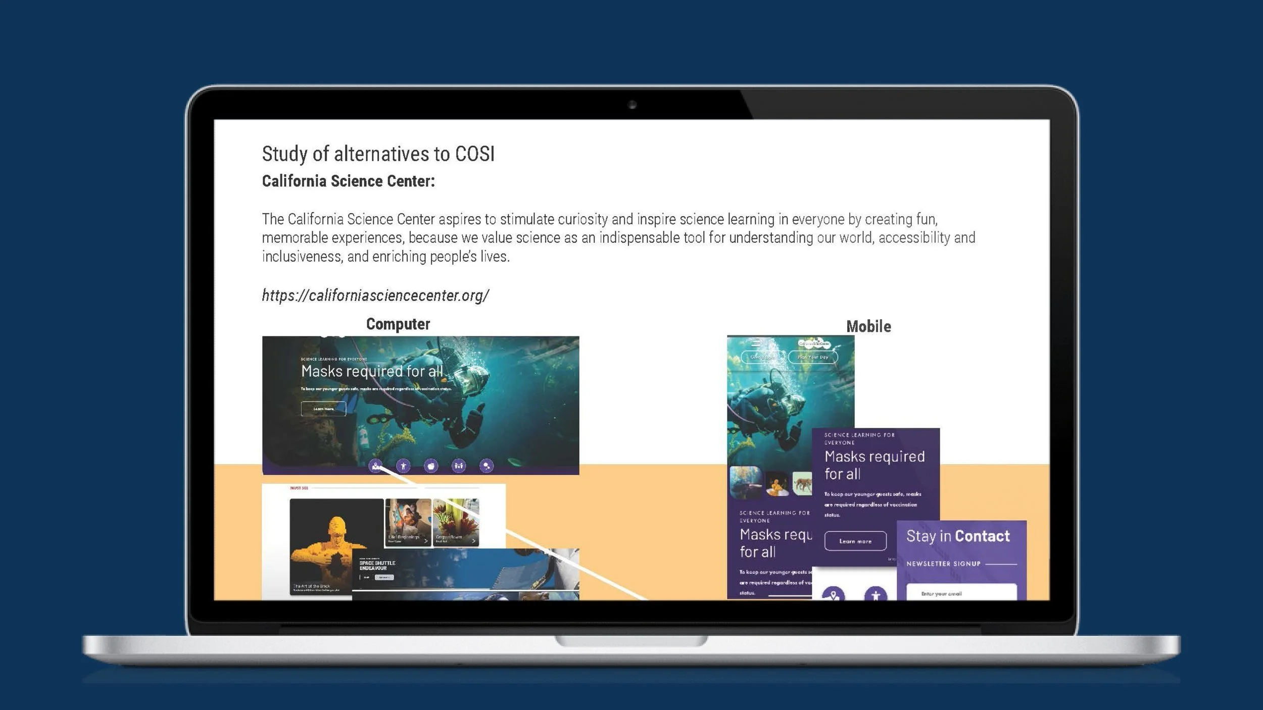
Problems
Problem One: The never-ending drop-down
On the mobile COSI site, there is an accordion dropdown menu that has an excessive number of dropdowns that overruns the screen when it is activated. The menu cascades down and continues down covering more than half the screen. If on a mobile device or a smaller screen, these menus make it confusing and overwhelming to the user.
Solution:
Provide a singular “hamburger” dropdown or slide-in menu that provides necessary links to commonly used pages. By reducing the number of dropdown options the layout will present more like the mobile app and customers will have a simpler time navigating.
Problem Two: Mobile/Web inconsistency
On the mobile version of the COSI site, the search option appears as a magnifying glass in the top right corner. However, when the user taps or clicks on it, a dropdown with predetermined options appears, preventing them from entering their own search query.
Solution:
Providing a more common search function on the mobile version of the COSI site would be to replace the existing dropdown menu with a text box or a search icon. This would allow users to enter their own search queries and get more relevant results. Additionally, it may be helpful to include a list of commonly searched items below the search box or icon for easy access. This would help to make the search function more user-friendly and intuitive, improving the overall user experience on the mobile site.
Problem three: Design continuity
Make the mobile page more like the app. On a mobile device, space is limited and content is king. The web and mobile pages have a similar but different feel compared to the app. Branding might be close but it doesn’t feel like a unified design. In the interest of keeping confusion low and branding unified a redesign of the main mobile page is suggested.
Solution:
To create a more unified design between the mobile page and the app, the icons for accounts, tickets, donations, contact, and map can be added to the mobile page thus making it consistent with the app's design. This will create a more cohesive user experience for visitors who use both the mobile page and the app.
Project Summary
The objective of this project is to optimize the COSI mobile website by addressing several usability issues, including overly long drop-down menus, a complicated search function, and a less streamlined design compared to the mobile app. To achieve this goal, I conducted an in-depth analysis of both the web/mobile sites and the mobile app of cosi.org, with a focus on menu usage, search functionality, and design consistency.
Our primary aim is to simplify the drop-down menus to match the menu on the COSI app, consolidate pages, and provide clear navigation for users. Additionally, I will improve the user interface by adding a keyboard to the mobile version, making it easier and faster for users to search for specific pages. By redesigning the webpage to match the mobile app, I will create a cohesive and consistent user experience across all platforms.
Who is Cosi:
COSI is a national science center located in Central Ohio. Generating interest in science, technology, engineering, and math (STEM) topics and delivering our experiential, "hands-on fun" brand of learning for 55 years. A trusted educational resource for families, schools, and community partners, engaging more than one million people annually through onsite, offsite, and online experiences.
Roles
User Experience (UX) Designer
Interaction (IxD) Designer
User Interface (UI) Designer
Information Architecture
Deliverables
Interaction Design:
Low and interactive prototypes
UX/UI Design:
Competitive analysis
User surveys and one-on-one interviews
Low-fidelity wireframes
High-fidelity mockups
Usability tests and findings
Project Specifications
Duration: 2 weeks
Tools:
Adobe XD
Adobe Indesign
Adobe Photoshop
Adobe Illustrator
User Interviews
During the user interviews, I engaged participants ranging from ages 19 to 80. I requested that they perform a set of tasks and identify any pain points they experienced while using the COSI web page and mobile app. I provided prompts for them to explore the webpage and respond with their stream-of-consciousness reactions. The data showed that users became overwhelmed by the number of dropdown menus covering a mobile screen, frustrated with their inability to enter questions into the search area, and bombarded with too much information on a single page.


My Design Process
Wireframes
I developed a robust, mid-fidelity prototype of the user flows utilizing AdobeXD, ensuring that the prototype was highly functional and accurately reflected the needs of the intended users. Concurrently, I commenced the recruitment process for test subjects who met the established criteria. During the first round of usability testing, I carefully monitored and documented user interactions and behaviors, identifying areas for improvement. Subsequently, I incorporated user feedback and iterated on the design, implementing solutions to the identified issues.


Usability Testing
Issue:
During the user testing phase, three participants between the ages of 19-80 were interviewed to explore their experience using the COSI website. Test results indicated that users found the excessive use of accordion dropdown menus on the mobile page frustrating and confusing, leading some testers to resort to refreshing the page to find their bearings. Testers also expressed a preference for a traditional search function commonly found on other websites, as the current search option on the mobile page turned into another dropdown menu displaying a list of predetermined search terms. Additionally, users were overwhelmed by the amount of information presented on a page. The design of the COSI mobile did not provide a unified user experience compared to the mobile app, it lacked the same feel and cohesion.
Solution:
To improve the usability of the COSI mobile page the accordion menus were replaced with a sliding menu with less visual chaos and the addition of directional toggles. Provided a more intuitive experience. By redesigning the search option to resemble a more conventional search bar with a text field and a search button the results provided will provide more relevant information in an organized manner. To create a more unified design between the mobile page and the app, I aligned the icons and overall layout to be consistent with the app's design. This will create a more cohesive user experience for visitors who use both the mobile page and the app.
What I Learned
Throughout this process, I gained insights into the importance of aligning the user experience of apps and web pages. I discovered that excessive use of dropdown menus can make navigation difficult and frustrating for users. Furthermore, I realized the value of a fully functional search option, as the lack of a keyboard to type in specific queries can lead some users to abandon a page. Lastly, I learned that a unified design can promote trust and encourage users to spend more time on a website.